As a designer and developer, we all know that UI and UX are very important to our users. It is our job to guide them to what we want them to see, to read, and to interact. Making a good UI design will help our users to understand what the application or website is all about. Considering we are now on the mobile era wherein all things are now accessible using our mobile devices. Amidst on the recent Miss Universe 2015 event, I think we can take away a good lesson from this on a UI perspective.
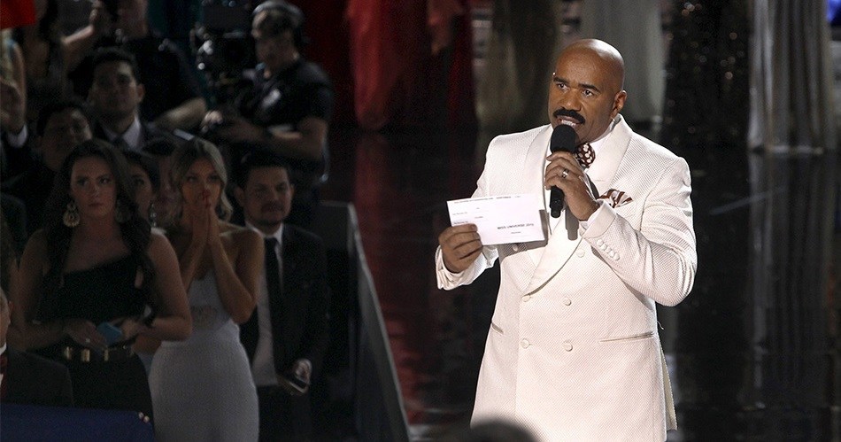
As we all know Steve Harvey made an honest mistake in announcing the winners. As a developer, I see several mistakes on the scorecard which, I suspect, lead to Steve’s mistake.
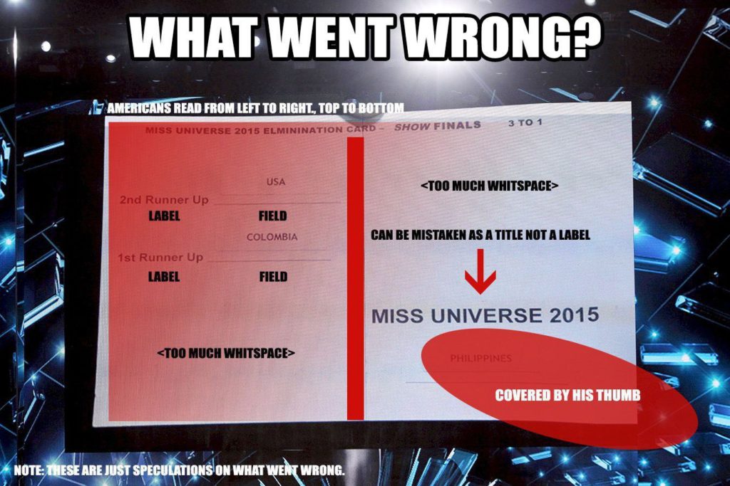
Here are points to consider on the scorecard:
- The scorecard was handed over on his right so he has to use his right hand to read the scorecard and his microphone on his left.
- Americans read from left to right, top to bottom. That is the usual reading pattern of users residing in the US.
- His thumb might had covered the country Philippines and mistakenly thought that the Miss Universe 2015 label on the bottom right-hand side as a title.
- There are two many whitespaces. These whitespaces signify “pause” or “rest” which makes Steve think that there’s no content afterwards
- There are inconsistencies on the scorecard. The Runner Up labels are on the left and the fields on the right while the winner has the label at top and field down below.
- The winner label is too big compared to the field. I know this has a purpose but taken to consideration that the bigger label might make the user think that the label is a title. The eyes are too focused on the title which leads me to suspect that it’s now too hard for the user to read the field or value.
- The labels and fields are not aligned which sometimes be hard for the reader to distinguish which is which.
Given these points and a considerable amount of pressure on his end, I think this had happened. I may be wrong, but that is how I see it. On a development and design perspective, I hope we can all learn on this event.
Feel free to leave a comment below.


